In one of my senior design classes, "Design Across Scales," I had a semester long project to reinterpret Charles and Ray Eames' Powers of 10 video for the present. What would the current scales that we navigate between be in 2018? In my mind, the clearest answer for an interconnected age was the scales of social society. How do people navigate their lives in a world where they have limited access to people in person, but can have hundreds of thousands of followers online, where one person's tweet can start or stop a revolution or war?
The question was very engaging for me, a senior in college whose world would expand very quickly past MIT to the rest of the world.
I tackled the question and focused on how MIT students navigated this space. I broke down the scales a student, faculty member, or general member of the MIT-affiliation could interact with: ~ 10^0, the individual. ~ 10^1, the group. ~ 10^2, the community. ~ 10^3 the society... all defined loosely, but based in convincing evidence of social dynamic theory.
The question to investigate: How much do you, the interviewee, impact the following scales within MIT?
Originally, my idea was to build a physical manifestation of their answers. A way to visually convey the power of their answers. I go into that a little further down...
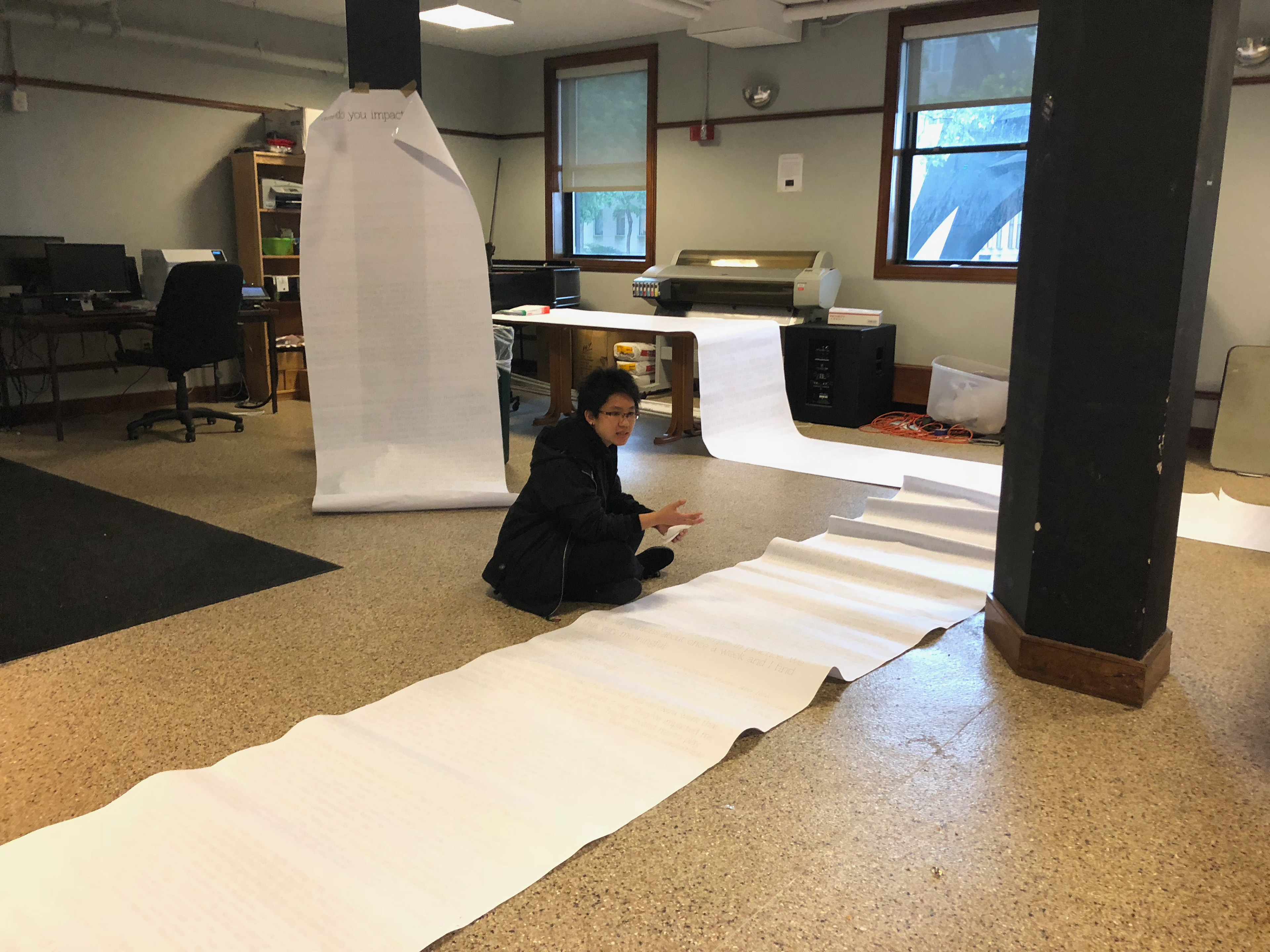
but after months of thinking, and ideating on projects and concepts i settled on simply interviewing people and using their direct quotes as the visualization of their impact. The more they self-reported their impact was in a certain order of magnitude, the larger their font. Then I simply printed their stories, grouped by the scale they answered to. People's answers could be larger or small both depending on how much they answered (quantity of words) and how much they viewed their impact (increased font size). The results were amazing.
I scaled all pages such that even the smallest sheet printed (that pertaining to societal impact) was well over 6' tall ("the smallest answer was still slightly larger than life, larger than any person answering the interview"). The longest paper was 50 feet long, and wrapped around the presentation room several times.
I have a lot of feelings about this project, but I'll stop talking now. Please enjoy a few select photos of my final report out to the design critics, my installation in my dorm to encourage community engagement with the results, and my earlier installation idea.
My idea for the final visualization of the project was not actually stories printed on paper. That happened as I found inspiration in Jenny Holzer's "inflammatory essays" and an installation where someone printed a scale model of the WTC buildings and hung the long sheets of print from a ceiling having the immense building wrap and fold into itself on the floor, heavy with weight.
Initially the idea was to use a router to cut out sheets of plywood. Individual contributors to the poll would be represented as cubes, with each answer a "facet of their total impact at MIT." One each of 4 visible sides, I would cut out a hole. The more impact they had in that scale, the more full the face was. The smaller impact, the larger the hole. Visually you could inspect how full or substantial a unit/individual felt in that respective scale.
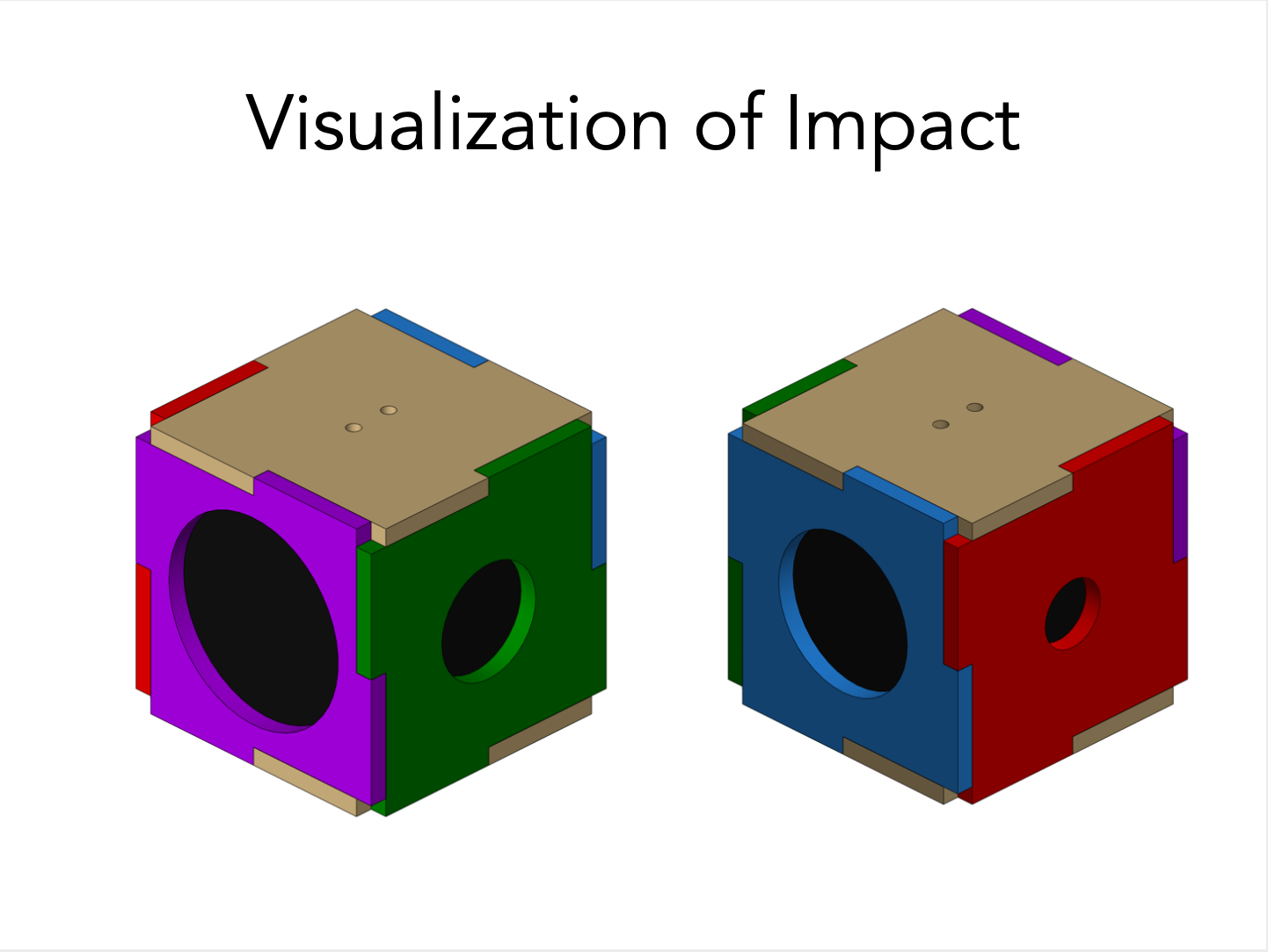
Assembled together as a larger reporting body, hung from the ceiling, you could see larger patterns. The viewer of the exhibit would have to walk around the large cube, assembled from the smaller cubes to view each collective face, and see if they could interpret results from the collected responses.
Eventually, I was able to clean up the way I wanted to present my interview research and think i found a way that was poetic and honest to the emotional weight of the responses. Here are the responses.