BEFORE I SAY ANYTHING ELSE:
MY CURRENT RESUME IS ON THIS WEBSITE. IT'S IN THE "RESUME" SECTION. THE INFORMATION BELOW HAS BEEN FROM MANY YEARS OF EDITING AND IS MOST LIKELY NOT ACCURATE, ESPECIALLY THE MIT EMAILS AND WEBSITES!
I make resumes for fun! I got really annoyed by how every resume looks the same, and how the templates are kind of drab. I don't think I'm drab, so I didn't want my experience to feel drab on first impression either.
So here are some of my many, many templates. Most of them I don't use, but I wanted to flesh out the ideas until I could easily tell whether it was worth using or not. Some are really pretty! Some are really.... interesting. But I think I'm getting better at making them as I keep experimenting and having fun.
I made DIY business cards for myself and printed them out. This way, I can fill in my info any time I want to anyone I meet. If I meet a sunglasses designer, I can be "the next best sunglasses designer" and hand them that card, or an engineer I can be "the next best product development engineer" with, and with whatever my current email and phone is. The best thing is, of course, that it's all true! I am certain if they help me develop my skills, I will be the next best [THING].


My neon template, with matching business card and logo. I'm still trying to make a neon themed website, because I think portfolios are boring too... but that's a bigger project than a sheet of paper :)
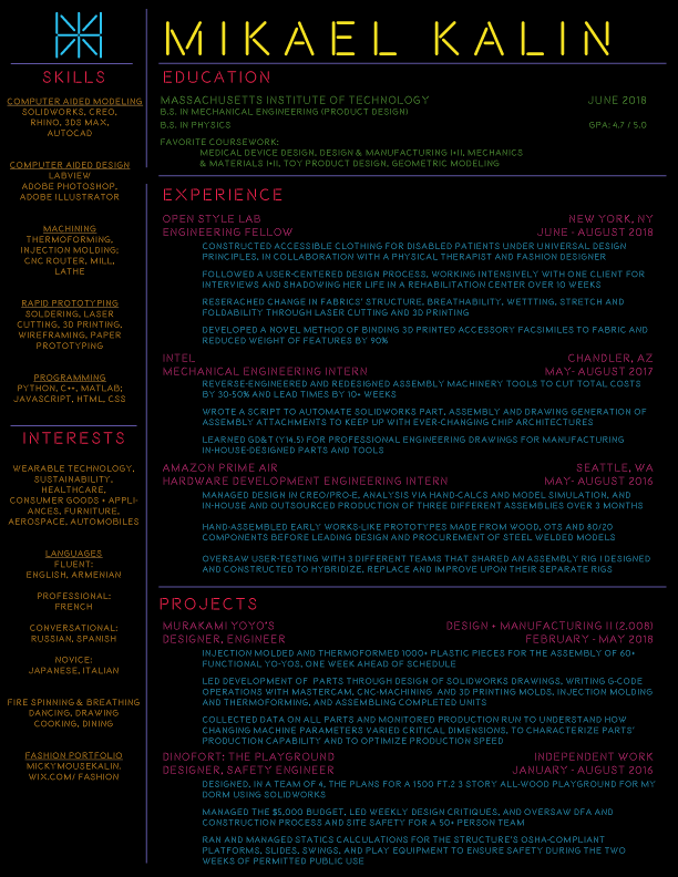
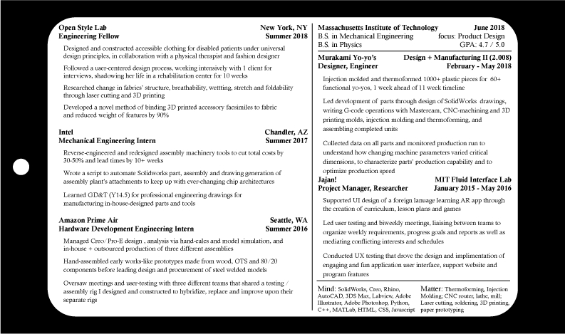
This one is themed after designer clothing price tags. I wanted to print out designer labels and walk around career fairs with this huge tag on my neck. I felt very much like a product at career fairs - always trying to "sell myself" which I took a little literally. I wanted to explore what that would look like, with an 8.5x11" "price tag" on my neck, showing all the things that made me valuable. Dolce and Gabbana can value their 100% cashmere sweaters, made in Italy; I could certainly value my experiences which made me QUALITY.
I made the following resume to try to play with color palettes. I use blue for almost everything but wanted to play with more playful colors. So below is a few of the other color palettes I made to try to explore the use of color to grab attention, to highlight certain areas, to leave emotional imprints, etc...

